Three DESIGN.md blueprints for electronics stores
Cyber-minimalist, editorial-Nordic, and dev-first token systems you can hand straight to an AI builder.
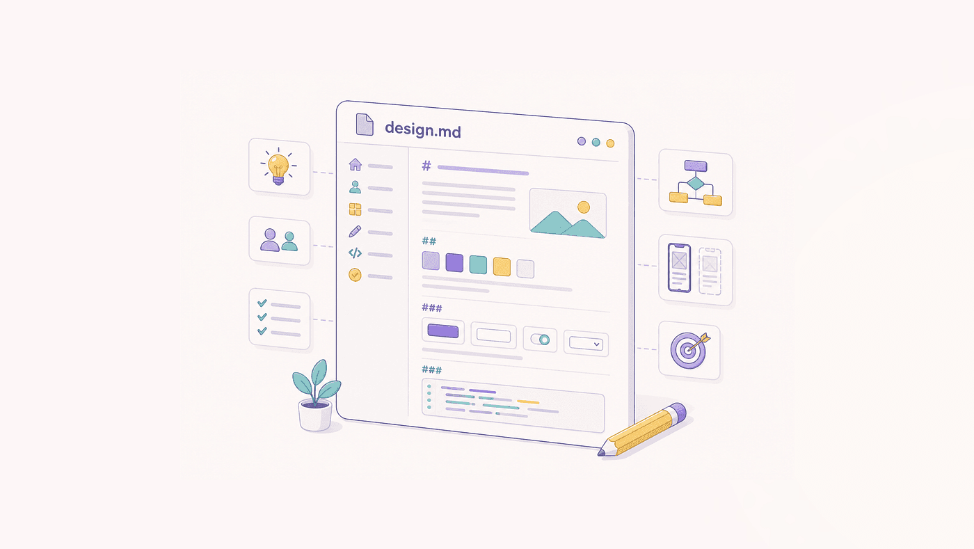
A DESIGN.md file is a structured Markdown document (often paired with YAML frontmatter) used by modern AI website builders, design systems, and frontend tools (such as LandingRabbit, v0, or custom AI design agents) to define a project's visual identity, token architecture, component specs, and UX rules.
Below are three complete production-ready DESIGN.md blueprints tailored specifically for an Electronic/Digital Products E-Commerce Store (gadgets, hardware, software, software licenses, or consumer electronics).
1. High-Tech Cyber-Minimalist (Sleek & Tactical)
Ideal for premium audio, mechanical keyboards, custom PCs, or flagship consumer electronics.
# Design System Specification: Cyber-Minimalist Electronics

---
theme:
  mode: dark
  direction: ltr
  border_radius: 6px
  density: compact
---

## 1. Color System (Design Tokens)

### Core Palette
- **Background Main (`--bg-main`)**: `#090A0F` (Deep obsidian dark)
- **Background Secondary (`--bg-surface`)**: `#12151E` (Elevated card container)
- **Background Hover (`--bg-surface-hover`)**: `#1B202D`
- **Text Primary (`--text-primary`)**: `#F4F6F8` (Ultra-crisp white)
- **Text Muted (`--text-muted`)**: `#8C96A6` (Subtle metadata/specs)
- **Border Default (`--border-color`)**: `rgba(255, 255, 255, 0.08)`

### Brand & Accents
- **Accent Primary (`--brand-glow`)**: `#00FF66` (Neon Cyber-Lime — CTAs, Buy buttons)
- **Accent Secondary (`--brand-electric`)**: `#00E5FF` (Cyan — Status indicators, tech badges)
- **Alert / Hot Deal (`--accent-alert`)**: `#FF3366` (Stock urgency, active sales)

---

## 2. Typography

- **Primary Sans**: `'Inter'`, system-ui, sans-serif
- **Monospace (Tech Specs)**: `'JetBrains Mono'`, monospace

### Hierarchy
- **Display 1 (Hero Tech Titles)**: `font-size: 3.5rem; weight: 800; tracking: -0.03em; family: Inter;`
- **Section Heading (H2)**: `font-size: 2rem; weight: 700; tracking: -0.02em;`
- **Product Title (Cards)**: `font-size: 1.125rem; weight: 600;`
- **Spec Labels / Code**: `font-size: 0.875rem; family: JetBrains Mono; uppercase; color: --text-muted;`

---

## 3. UI Components Architecture

### Product Cards
- **Border**: `1px solid var(--border-color)`
- **Hover Behavior**: Subtle Y-axis lift (`-4px`) with custom lime glow halo (`box-shadow: 0 8px 30px rgba(0,255,102,0.15)`).
- **Badge Tag**: Pill shape, background `rgba(0,255,102,0.1)`, text `--brand-glow`, border `1px solid --brand-glow`.
- **Spec Grid**: 2x2 inline grid showing key hardware specs (e.g., Battery, Connectivity, Chipset) in monospace.

### Buttons & Interactive Controls
- **Primary CTA ("Add to Cart")**:
  - Background: `--brand-glow` (`#00FF66`)
  - Text: `#090A0F` (High-contrast dark)
  - Font: Bold, uppercase, letter-spacing `0.05em`
  - Hover: Brightness `1.15`, scale `1.02`
- **Secondary Action ("View Specs")**:
  - Background: `transparent`
  - Border: `1px solid var(--border-color)`
  - Text: `--text-primary`

---

## 4. E-Commerce Layout & UX Rules

1. **Product Spec Matrix**: Never use plain paragraphs for technical specs. Format all hardware features into clean key-value grid tables.
2. **Sticky Quick-Dock**: Sticky bottom bar on mobile with product title, live stock ticker, and a 1-tap "Buy Now" CTA.
3. **High-Contrast Photography**: All product renders must sit on seamless `#090A0F` background with high-contrast rim lighting.
2. Clean Editorial Modern (Nordic / Apple Style)
Ideal for smart home devices, IoT hardware, minimalist headphones, and high-end consumer tech.
# Design System Specification: Clean Editorial Tech

---
theme:
  mode: light
  direction: ltr
  border_radius: 12px
  density: comfortable
---

## 1. Color System

### Core Palette
- **Background Primary (`--bg-primary`)**: `#F9FAFB` (Soft matte off-white)
- **Surface Elevation (`--bg-card`)**: `#FFFFFF` (Pure clean card background)
- **Text Primary (`--text-primary`)**: `#111827` (Rich dark slate)
- **Text Secondary (`--text-secondary`)**: `#6B7280` (Neutral gray)
- **Border Accent (`--border-light`)**: `#E5E7EB`

### Accent Tokens
- **Brand Primary (`--color-primary`)**: `#000000` (Monochrome luxury)
- **Highlight Accent (`--color-accent`)**: `#2563EB` (Electric Royal Blue)
- **Eco / Battery Status (`--color-success`)**: `#059669` (Sage Emerald)

---

## 2. Typography System

- **Primary Font**: `'SF Pro Display'`, `'Plus Jakarta Sans'`, sans-serif
- **Scale**:
  - **Hero Header**: `4rem`, tracking `-0.04em`, line-height `1.05`
  - **Sub-headline**: `1.25rem`, weight `400`, color `--text-secondary`
  - **Price Display**: `1.75rem`, weight `700`, monospace figures

---

## 3. UI Component Directives

### Hero Section
- **Layout**: 60/40 Split. Left column contains giant typography and primary CTA. Right column contains dynamic 3D asset/product render.
- **Micro-copy**: Subtitle must feature a pill tag (e.g., `[ In Stock • Ships in 24h ]`).

### Product Cards
- **Card Radius**: `16px`
- **Shadow**: `0px 4px 20px rgba(0, 0, 0, 0.03)`
- **Image Aspect Ratio**: `4:3` on warm neutral backdrop `#F3F4F6`.
- **Hover**: Smooth zoom on product asset (`scale(1.04)`) over `300ms cubic-bezier(0.4, 0, 0.2, 1)`.

### Checkout & Cart Drawer
- **Drawer**: Slide-in from right (`380px` fixed width on desktop).
- **Express Payment Icons**: High-priority placement for Apple Pay, Shop Pay, and Google Pay above standard form fields.

---

## 4. Content & Asset Rules

1. **White Space First**: Maintain at least `80px` padding between vertical sections on desktop.
2. **Feature Highlights**: Highlight core product benefits using 3-column iconography cards featuring thin `1.5px` stroked icons.
3. Digital Software & Developer Tools (Dev-Focused / SaaS Store)
Ideal for digital downloads, API keys, software licenses, firmware, and SaaS products.
# Design System Specification: Dev-First Digital Store

---
theme:
  mode: dark
  border_radius: 8px
  code_theme: github-dark
---

## 1. Color Tokens

- **Canvas (`--canvas`)**: `#0D1117`
- **Surface (`--surface`)**: `#161B22`
- **Border (`--border`)**: `#30363D`
- **Text Main (`--fg-main`)**: `#C9D1D9`
- **Text Bright (`--fg-bright`)**: `#F0F6FC`
- **Brand Accent (`--accent-purple`)**: `#8957E5`
- **Interactive Active (`--accent-blue`)**: `#58A6FF`

---

## 2. Typography & Code Hierarchy

- **UI Sans**: `'Geist'`, `'Inter'`, sans-serif
- **Code/Terminal**: `'Geist Mono'`, `'Fira Code'`, monospace

---

## 3. Digital Asset Specific Components

### License Tier Cards (Pricing)
- **Highlight Card**: Radial gradient overlay `radial-gradient(ellipse at top, rgba(137,87,229,0.15), transparent)`.
- **Feature Checkmarks**: Neon green checkmark icons (`#3FB950`).
- **Instant Delivery Badge**: Display `Instant License Key Delivery via Email` badge under every buy button.

### Code / Terminal Preview Widget
- **Styling**: Wrapped in a dark code block with macOS-style window controls (red, yellow, green top dots).
- **Features**: One-click "Copy Command" button (`npm install ...` or `git clone ...`).

---

## 4. Store Conversion Guidelines

1. **Instant Checkout**: Enable guest checkout by default with zero registration friction.
2. **Social Proof Pill**: Floating real-time toast notification in bottom-left corner ("Someone in London just purchased License X").
How to use these DESIGN.md files
- Save as
DESIGN.mdin your project root directory or upload it directly to design engines (like LandingRabbit, v0, Bolt, or Cursor). - Feed to AI Builders: When prompting an AI web builder, pass this file and say: "Build an e-commerce website using the exact design tokens, typography scale, component rules, and layout logic defined in
DESIGN.md." - Maintain Consistency: Share this file across your engineering, design, and marketing teams to ensure every new landing page or product card matches your exact brand guidelines.
What is a DESIGN.md file?+
A structured Markdown document, typically with YAML frontmatter, that defines a project's color tokens, typography scale, component specs, and UX rules so AI website builders and design systems can generate consistent, on-brand output.
Which DESIGN.md variant fits a hardware brand versus a software brand?+
Cyber-Minimalist and Clean Editorial suit physical hardware — audio gear, keyboards, IoT devices — while the Dev-First Digital Store variant targets software licenses, API keys, and downloadable products, with a code-preview widget and instant-delivery badge.
How do I use a DESIGN.md file with an AI builder?+
Save it as DESIGN.md in the project root or upload it directly to the builder, then instruct the tool to build using the exact tokens, typography, component rules, and layout logic defined in the file.